The Anatomy of AI Visibility: Decoding Your Dashboard Metrics
Operyn’s Dashboard provides a macro view of AI visibility by showing brand mentions, citations, platform performance, topic strength, competitive position, trends over time, and mention-to-citation gaps that require deeper diagnosis in later modules.

Ly Phan
AI Visibility Researcher and Editor
Update on
Product Mechanics

Welcome to Part 3 of the Operyn Product Guide Series. (If you are just joining us, start with Part 1: Calibrating Your AI Tracking Environment.)
In Part 2, we established that reading visibility metrics requires intent segmentation. Now that you understand how to interpret the Share of Voice numbers, it's time to open your Dashboard and learn what each section tells you.
The Dashboard is your macro-level overview. It answers one question: how visible is my brand across AI engines right now? Everything on this page is a summary. Deeper diagnosis happens in the modules we cover in Parts 4 through 9.
Brand Visibility
The headline metric at the top of your Dashboard is Brand Visibility: the percentage of AI responses that mention your brand across all tracked queries. In the example below, Batdongsan appears in 298 out of 536 total responses, producing an 53.9% visibility score.
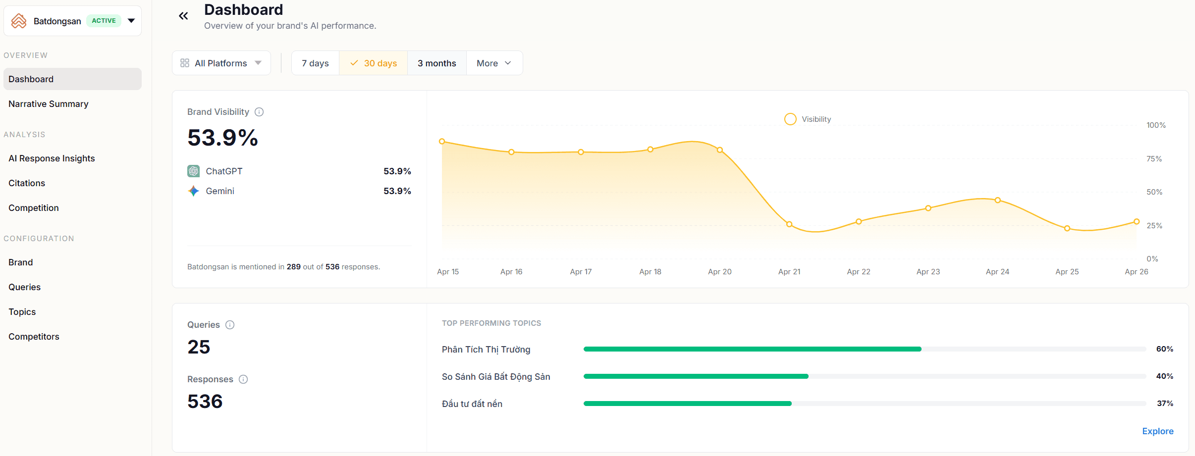
Directly beneath the headline number, Operyn breaks visibility out by AI platform. This split matters because each model uses different training data, different retrieval pipelines, and different ranking logic. A brand that dominates one platform can be invisible on another. If you see a significant gap between platforms, that's a signal to investigate which model is underperforming and why when you reach the AI Response Insights module later.
The trend line to the right tracks visibility over your selected time window (7 days, 30 days, 3 months). Use it to spot directional shifts. A sustained drop in visibility across platforms suggests a systemic issue: either the models updated their training data, a competitor's content gained ground, or your tracked queries shifted in composition.
Queries and Responses
Below the visibility metric, the Dashboard shows two counts: Queries (the number of prompts you're tracking) and Responses (the total volume of AI-generated answers Operyn has collected across those queries and platforms).
These numbers set the statistical baseline for everything else on the page. A dashboard built on 5 queries and 20 responses will fluctuate with every new data point. A dashboard built on 25 queries and 536 responses gives you a more stable read. If your response volume feels thin, revisit Configuration > Queries and add more prompts using the intent tiers from Part 1.
Top Performing Topics
Next to the query count, the Dashboard ranks your topic clusters by visibility percentage. This tells you at a glance which parts of your market the AI models associate you with most strongly.
A topic ranking high here means the AI brings your brand into answers frequently when users ask about that subject. A topic ranking low means the opposite: the models don't connect your brand to that space, even though you've configured queries for it.
The Dashboard shows your top three topics by default. Click "Explore" to see the full list. You should use this as a prioritization tool. Topics with low visibility despite high commercial value are content gaps. You'll diagnose the specific cause in the Narrative Summary (Part 4) and AI Response Insights (Part 7), but the Top Performing Topics section of the Dashboard tells you where to look first.
Brand Landscape
The Brand Landscape scatter plot maps your competitive position visually. The chart plots Citations on the X-axis against Mentions on the Y-axis, using absolute counts across all tracked queries. Each brand in your competitive set appears as a point.
Here is how to read position:
High mentions, low citations (top-left region). The AI models talk about you frequently but rarely link to you. Your brand has strong semantic awareness but a gap between awareness and referral action. This is common for established brands whose content isn't optimized for RAG retrieval.
Low mentions, high citations (bottom-right region). When the AI does mention you, it links to you. But it doesn't bring you up often. Your domain is trusted as a source, but your brand lacks broad presence in the model's training data.
High mentions, high citations (top-right region). The AI names you frequently and links to you when it does. Your brand holds strong semantic awareness and your domain is trusted as an authoritative source. This is the position you're working toward.
Low mentions, low citations (bottom-left region). The AI rarely names you and rarely links to you. If a competitor sits here, they aren't a threat in AI search yet. If your brand sits here, your starting point is building semantic presence before worrying about citations.
The Brand Landscape gives you a snapshot of where you stand relative to competitors. It does not tell you why you're in that position. The Narrative Summary (Part 4) and Competition module (Part 5) break that down by topic cluster.
Mentions Over Time
The Mentions chart tracks your mention volume over your selected time window, with a "Most Mentioned Brands" panel alongside it showing absolute mention counts for you and your competitors.
This section answers two questions: is your mention volume stable, growing, or declining? And how does your volume compare to the competition?
A sudden spike in a competitor's mentions is worth investigating. It could reflect new content they published, a product launch that entered the models' retrieval index, or a shift in how the models associate that competitor with your tracked topics. The AI Response Insights module (Part 7) lets you drill into the specific queries and responses driving the change.
Citations Over Time
The Citations chart mirrors the Mentions chart but tracks clickable links to your domain. The "Most Cited URLs" panel shows which of your specific pages are earning citations and how many each has accumulated.
This is where you start to see the Mention-to-Citation Leakage Gap in practice. If your Mentions chart shows strong, stable volume but your Citations chart lags behind, the AI models are naming your brand without linking to your site.
There are two reasons this gap can exist. The first is parametric recall: the model answered from training weights without triggering a web search, so there was nothing to cite. That's structural, not a problem to fix. The second is actual citation leakage: the model searched, found sources, and linked to someone else's domain instead of yours. Part 4 covers how to use the Narrative Summary to diagnose which of these is driving your gap.
The Most Cited URLs panel also reveals concentration risk. If 95% of your citations point to a single URL (like your homepage), the AI models don't know your deeper content exists. Later modules cover how to distribute citation authority across more of your pages.
What the Dashboard Doesn't Tell You
The Dashboard is a summary layer. It shows you the what but not the why. It won't tell you which specific queries are driving your visibility, how the AI frames you against competitors, or which of your pages are losing citations to third-party domains.
Those answers live in the modules we cover next. Use the Dashboard to orient yourself: identify your overall visibility baseline, spot which platforms and topics are strong or weak, and flag gaps between mentions and citations. Then move into the Narrative Summary for diagnosis.
Next in this series: Part 4: Diagnosing the Leak: How to Read Your Narrative Summary moves from the macro-level dashboard into topic-level diagnosis, showing how to identify which content clusters are bleeding citations and where the traffic is going instead.
Share on social media


